The Ohio State University Mobile App
Redesigning the University’s official mobile application
2016 - 2018
Project Brief
As a designer at The Ohio State University, I was given the task of redesigning the current Ohio State Application to be more intuitive and have a native iOS feel. The new application should feel like an extension of iOS 10 interwoven with Ohio State’s branding guidelines.
My Role
I served as the Lead UX/UI and Visual Designer on this project, working alongside Ohio State mobile developers and my project manager.
Research
Existing Application Analysis
I began the redesign by analyzing the existing mobile layout. The app interface was outdated, difficult to navigate, and cluttered with unessential screens.
Looking at the Data
Luckily, we were given access to a one-month period of data on application usage. This allowed us to quickly see which pages had high amounts of traffic, and which were glanced over. Using this data, we could establish an informed hierarchy.
From the Page View analysis, we could see that the bulk of the page views took place on the home page, followed closely by the Class Term List. In fact, over half of the top-visited pages in the application were related to grades or classes, indicating that students value class information highly.
We also began to see a trend in campus-related screens. Screens that displayed wayfinding information or campus details tended to have high viewing numbers. These screens included campus navigation, buses, and building pages.
Once we established high-traffic content, we needed to look at the other end of the spectrum; which pages were deemed unimportant and seldom visited by users? Throughout the initial stages of the redesign, we frequently negotiated with University marketing to cut out features that took up space and offered little to the users. Some of these features include Ohio State’s Twitter feed and images of students making the O-H-I-O sign. After sharing the extraordinarily small page-visits that these features received, we scrapped some of these filler sections entirely.
User Surveys & Interviews
We administered a survey to a range of students at the University to gauge what they deemed most important in a new Ohio State app. Their responses largely reinforced what we had discovered in our initial data analysis; students want the application to be a one-stop tool for accessing applicable Ohio State resources.
Personas
Personas were created to ensure that we capture the holistic wants, needs, and desires of the various stakeholders that will be using the application. These personas include On-Campus Students, Online Students, and Faculty & Staff. Obviously, Ohio State students are going to be the largest user demographic, but we could not neglect the visitors, parents, or staff that may end up using the application.
Ideation
Whiteboard Brainstorming
After researching the current application, the data, and the userbase we needed to visualize our thoughts. We looked at why users would want to use the application, the drivers and goals behind use, and the wants and needs of the stakeholders. We made initial whiteboard maps, and found ourselves in a loop of clustering and categorizing our thoughts, and erasing and learning from rabbit-holes and improper assumptions.
Through our exploration of concepts and ideas, we arrived at four definitive user needs for this application: academics, campus life, way-finding, and curated content. The application needed to provide content depth within these categories while allowing the user to easily and quickly navigate. Ultimately, the user will only be using the application when they want to complete specific tasks; it would be rare and inconsistent for a user to open the application simply to browse. The application needed to be a tool at its core.
We concluded that we could satisfy the user needs by providing a navigation bar that included home, accounts, campus, navigation, and an in-depth search function.
Wireframe Sketching
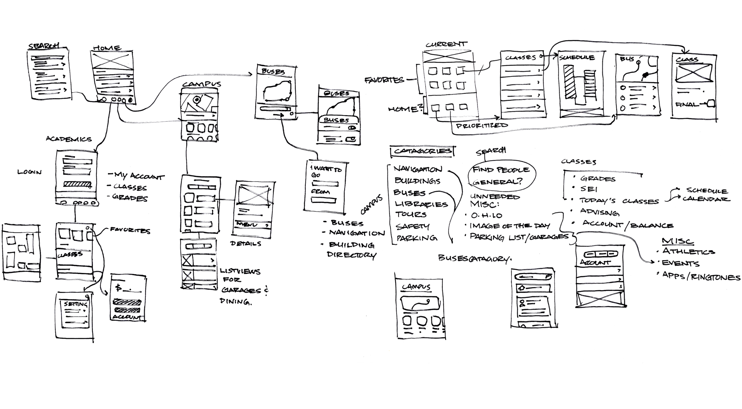
Based on the insights from our brainstorming and whiteboarding sessions, I began sketching rudimentary screen ideas to connect our conceptual user experience to a tangible user interface.
Style Guide
The Ohio State iOS Style Guide was created to work concurrently with iOS 10 Human Interface Guidelines. We utilized Apple's native iOS fonts, alongside Ohio State’s color palette and branding rules. I created a series of monoline icons and other assets to communicate this partnership between branding guidelines.
Low Fidelity Wire-frame Prototyping
I made quick wire-frame sketches on gridded paper to get a tangible view of the relationship between screens and the interactions that may take place from screen to screen.
UI Flow Diagram
After we had a solid foundational information hierarchy, I began creating screens and assembling them in a flow diagram to get a complete understanding of the application's relationships.
Implementation
Impact
The app has been received strongly by the student body; the 30-day active user count after two weeks was nearly 70,000. We have had an average of 2,900 more daily users and nearly 10,000 more monthly users since we released the final redesign. The final design resulted in 120 screens, of which the Buses and My OSU pages saw substantial page-visit growth.
“Great resource. Functional, easy to use, and full of useful information.”
Next steps
Towards the end of my tenure at Ohio State, we revisited the application to update it for iOS 11 guidelines. This allowed us to update iconography, screen layouts, and readdress several UX functions that didn’t play out as well as we expected.


